

Howdy yall, I have gripes with the iOS UI and I spent way too long on these edits. Here are my proposed edits.
Option to have an alphabetical grid App Library.

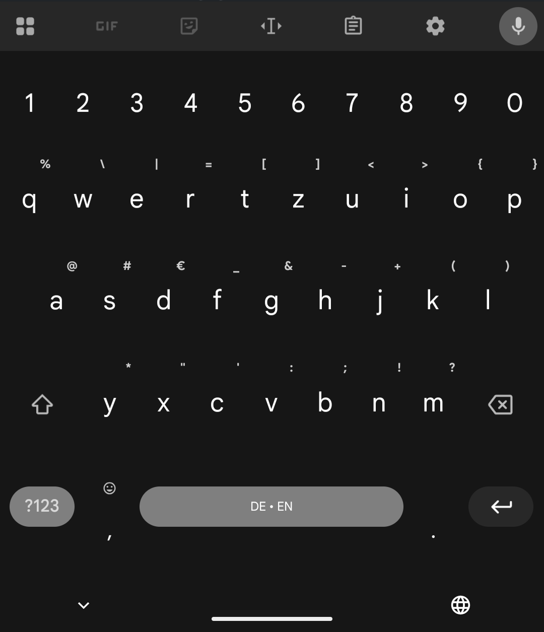
The keyboard should ditch the microphone and globe icons on the bottom, move the keyboard down, and add a number row. The mic and globe can be repurposed in the ui somehow.

I just want to have horizontal brightness and volume sliders.
This community gets so much hate and posts get downvoted so much for little reason.
Edit: I’d like to point out to oustiders that we cannot necessarily afford to switch to an Android or Linux phone due to financial, social or political reasons at the moment and iOS users here are just trying to do the best they can with whatever they have. So please be a bit considerate.
You want iOS to look like Android 16?
The app library on the pixel 8 is exactly how you want it to look and behave like.
The globe icon is in the spacebar, under the keyboard and also behind the plus/drawer icon. A bit to many options there but it is how it is.
And the sliders are horizontal but for volume only when you press the three dot menu after changing the volume.
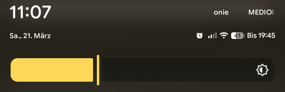
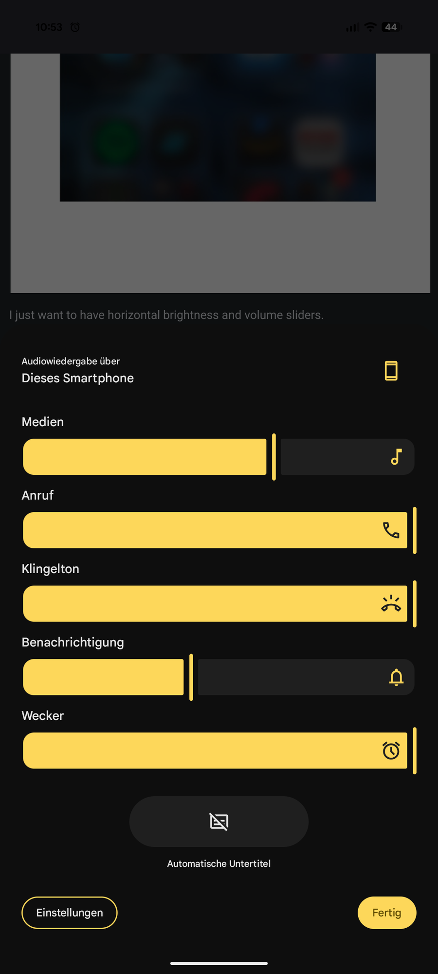
I just want the options for it at least.
I the past it was locked but can you already change launchers without jailbreaking?
On iOS? I don’t think so
Yes, this could have been an option that would satisfy everyone, if you don’t like the look of your laucher, just install a different one, you want a different keyboard, just change it.
There are keyboards on iOS but they are LIMITED.
Bravo for putting your ideas out there. I feel like apple communities need more of this sort of thing.
Thanks!
This is what my Android looks like. You can even make it automatically open the keyboard to type app names. It searches the settings too. The top row is most recently opened I guess, but apart from that it’s alphabetical. Does Apple not know how to alphabetize?

This is the default view of the app library it looks jumbled and messy.

However, if you Swipe down it’ll give you a single file list view.

And honestly, if they just fix the fucking keyboard, I would be 1 million times happier.
The horizontal volume and brightness I can understand; not my preference but I get it.
I can’t imagine why you would want to scroll through an alphabetic list of apps though?
Because that sorting makes sense instead of arbitrary categories that may or may not be embedded in the app data.
If you go to the App Library and pull down, you get an alphabetical list of apps. It’s also available in Settings-> Apps.
But if you know where the app you want is in the alphabet just pull down from any page in springboard and start typing the name.
I wish it was default behavior, the categories aren’t very useful IMO.
I avoid the App Library for the dash style search (pull down)
That’s usually how I launch my apps. I have a fairly minimal setup.
Plus some people have brains that just work with this.


